PLAN FOR SKULL A DAY PHOTOGRAPH
PLAN:
16 Feb 2015 - Plan the places to take photo and equipments that we need on the day to take the photograph
28 Feb 2015 - Buy materials with partner
29 Feb 2015 - Bring materials and start working on it
Material list: - newspaper, cotton/ cotton buds, feathers, flowers, color paper, buttons
2 March 2015 - Draw 6 doves and trace it with cradboard papers.
3 March 2015 - Bring in materials and start sticking materials together on the card boards
Goal: Finish 2 doves in class
7 March 2015 - Continue working on the doves
Goal: Finish 2 doves in class
8 March 2015 - Continue working on the doves
Goal: Finish 2 doves in class
9 March 2015 - (Working after school) Prepare and set up the background materials.
- Take 6 photos and edit them.
- Print out the photos after finish editing.
10 March 2015 - Decorate the carboards that the photos will be presented on.
- Work on wix site, upload process photos.
11 March 2015 - PROJECT DUE.
Details for plan/ Process:
1. We planned to sketch out 6 doves that's A3 sizes and work on it. We want to then work on the dove sample and stick the materials on it.
We found this dove picture online and
we followed this sample to draw 6 doves
2. Stick the materials to the dove sample ( ALL MATERIALS USED WILL BE AT THE END)
3. Prepare background materials (ballons, set up ribbons..etc)
4. Set up background & take the pictures
5. Finish up the final display board to display our photos and decorate the board
- We put the 6 photos on the board and our theme is ''freedom''. We used the material that we used to create the products to decorate it. We used ribbons and and ballon to surround our topic word freedom. We also put descriptions beside each photo by saying what materials did we use for the dove and the materials that we used to create the background. We put the materials that we used on the top of the description as well.


We used some cardboards, trace the dove on the cardboard, and cut it out.


The descrpition beside the photo including background info, dove materials & actual materials that has been used.


We wanted to use some different fonts for our topic word to represent the feeling of freedom. We didn't use fonts like arial cause we feel like it's too straight, neat where it looks too formal and it doesn't really represent freedom that matches our topic. We decided to use cursive because it gives people a feeling that it's more freely and the ending can always keep on going like an infinite ending which is also an element of freedom.
Here are some sample that we tried out for our font.
Outside influences:
1. Where Jesus was born/ Hay
- The hay where Jesus was borned was our influences. We used glitter strings to represent the hay and we put the dove on the hay to represent how 'Jesus was borned in the hay'. In this photo for the background it is the glitter strings = the hay and the dove is Jesus.
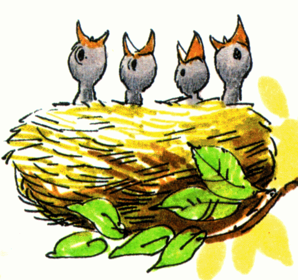
2. Bird Nest
- The inspiration of the bird nest is also similar to the idea of hay. The bird nest is usually the place where new eggs and baby birds are borned, which has the positive and happy feeling because something new is borned. Overall theme is freedom which our overall mood is positive and happy therefore we wanted to include this positive energy like in our photos. We used the gliter strings to form a bird nest shape like and put our dove in the middle to pretend like it's the baby birds and eggs born in the nest.
3. The idea that ''an animal is wearing clothes''
- In one of our photo we used different buttons that we got inspirations from an idea that an animals is wearing clothes. We used buttons to cover the dove and it looks like the dove is wearing clothes.
4. Peacock's body shape & feathers
- The dove's skin is similar to feather's textture but all doves are just usually in white color. I got the inspiration from the similar skin texture from the peacock and doves. I want to make the dove more colorful just like the peacock which it's usually very colorful and attractive. This can make the normal dove looks more special and interesting that it will catch people's attention since it looks similar to a normal dove but yet it is more special and fun like. I also wanted to create the illusion where an animal is wearing another animal's skin in which the dove is wearing the peacock's skin and body.
5. Font/ Idea of comparsion in Graphic Design
- There's this idea in graphic design that i learnt during a graphic design class in university where when there's different shapes, sizes, colors goes together, it can usually makes something stands out. For example, where you put a big font size besides smaller font size, obviously the bigger font size is going to stand out. Also, from my artist moment reasearch, it also shows that certain colors such as red, orange, yellow that's more sharp, it usually catches people's attention more. Therefore in one of our dove, we used different fonts in different colors, sizes, shapes..etc to make comparsions which makes our dove not just only with fonts but also with eye-catching elements.
6. Magazines
- Magazines usually include a lot of pictures, colors, and words in it. We feel like these things are all around us in daily life but we never really pay close attention to it. In our developing and brainstorming stage, we have thought of using those images and words from a magazine to make people understand the idea that even small things in our life can turn into art and art doesn't have any restrictions. I also hope that it can make people appricate things that's around us more.


Final Photos & Display board
Brianstroming stage from our outside influences.. :

We have 6 ideas from the theme ''freedom''
Materials:
1. Magazine papers (fonts)
2. cotton buds
3. feathers
4. dry flowers
5. buttons
6. twisted colors papers
For materials, we chose some materials that we always see in daily life so that people can easy make connections to it and we want people to understand that everything we see can become art and art doesn't mean we have to use fancy materials.
Backgrounds:
1. Kites and color paper strings
2. Gliter strings (as a bird nest)
3. Ballons
4. Ribbons
5. Bubbles
6. Playground
For background, we want to keep that positive and happy mood in our photos therefore we chose something that children related, such as kites, ballons, bubbles, playground..etc. We want people to relate that when we were at young ages at children we are always happy and free.
Color choice in materials & background:
- We didn't choose any deep or dark colors because freedom usually makes connection with skies, lighter and positive colors. Therefore we sticked with light colors such as light blue color as our ribbon, red and yellow for our ballons, pink dry flowers, colorful twisted papers, white cotton buds and buttons.


Photo 1:
Material: dry flower
Background: glitter strings as a bird nest
This is the idea where we used dry flowers for our dove and we used glitter strings as the background to make it looks like a baby dove born in the bird nest.
Photo 2:
Materials: newspaper font,
Background: yellow and pink ballons
Idea: This is the idea that we want to make comparsions between different fonts. We chose to use colorful ballons to match the fonts becasue we think the fonts are too simple and there isn't much colors in it and it will look good with colorful background.
Photo 3:
Materials: cotton budds
Backgound: lightblue ribbons
Idea: This is the idea where we use cotton buds as the material for the dove and put random ribbons in the background because we want it to be more freely that's why we put the ribbons randomly showing that there isn't any restricutions
Outside influences:
We match white cotton buds and blue ribbons because we think the colors looks like an angle's colors like how the white angles have blue wings in heaven
Photo 4:
Materials: Color papers and we twisted it into the different shapes
Background: color paper strings with a kite
We wanted to use a real kite and put it in the sky however there isnt enough wind to let the kite fly therefore we used a fake paper kite,
Idea: In this one, it can show our theme and idea of freedom and the color choices that we chose to represent it. We chose very colorful papers to catch people's attention and we want people to feel the poitive energy in it.

Photo 5:
Materials: buttons
Background: playground
Idea: We wanted to relate our topic freedom to children therefore we chose the background to be some children's places - playground. We think the white buttons matches with the background because the background is more colorful and the dove is more plain which it has some contrast in it.

Photo 6:
Materials: feathers
Background: bubbles
Idea: Bubbles fly all the time and it makes me think of our theme freedom. We want to make it feel like the dove is flying freely in the sky as the feather's directions/shape makes it look it is flying. For color choices here, we also chose very eye-catching colors for the feather and we got that inspiration from the peacocks. For the bubbles, we also choice some pinks one so it can matches the feather's color.
Final display board:
- The board's creating process and ideas are in the process part. (mentioned already)
